Genomic plots with circlize
Posted on Sat 29 April 2023 in R
Introduction
Genomics is undoubtedly a complex science. The human genome is huge, with more than 3 billion base pairs, about 20,000 protein-coding genes, several millions of variants, and many more interesting characteristics. The visualization of genomic/omics data is challenging due to the sheer volume of information. Circular plots are a popular way to extract information at a glance from omics-level information.
In this post, I will demonstrate the circlize package from R software, a versatile tool with applications in Genomics.
As always, I will post the code of this demo in my portfolio.
Necessary packages
I will use the following R packages:
library(tidyverse)
library(glue)
library(circlize)
Install any of them with the function install.packages(), for example:
install.packages("tidyverse", version = ">= 1.5.0") # we need this version or later
install.packages("glue")
install.packages("circlize")
Preparing the data
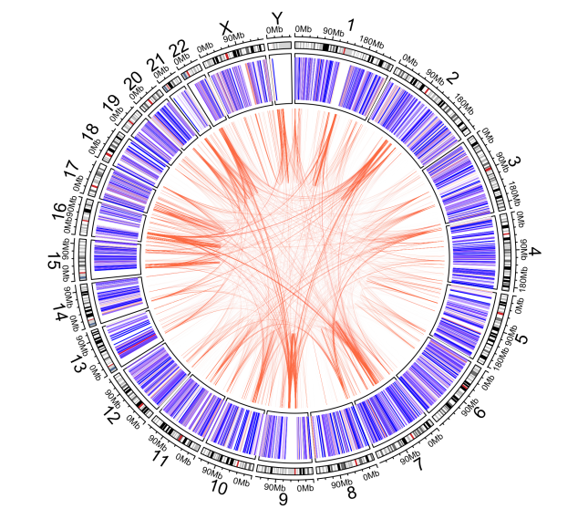
In this demo, I will create a simple circular plot showing the mean number of pathogenic variants per 100,000 base pairs windows (intervals) in the human genome, as well as showing regions involved with segmental duplication.
Thus, I create a variable named intervalWidth representing the 100,000 bp intervals to use later in the script:
# Magic numbers ----
intervalWidth <- 1e5
This is a fancy way to write the number 100,000. Then, I create two variables to hold the web links containing the data. The first one is the ClinVar variant summary. I will extract the pathogenic variants’ coordinates from it and calculate the mean number of them in each interval of the human genome.
The second one is a dataset from UCSC storing the coordinates of segmental duplication regions in the human genome.
# Dataset links ----
variantSummaryPath <- "https://ftp.ncbi.nlm.nih.gov/pub/clinvar/tab_delimited/variant_summary.txt.gz"

genomicSuperDupsPath <- "https://hgdownload.soe.ucsc.edu/goldenPath/hg38/database/genomicSuperDups.txt.gz"
Preparing the ClinVar data
Let’s import the ClinVar dataset and keep only germline, pathogenic, single nucleotide variants mapped in the GRCh38 assembly, excluding those in the mitochondrial chromosome:
pathogenicSNVs <- variantSummary %>%
  filter(OriginSimple == "germline") %>%
  filter(Assembly == "GRCh38") %>%
  filter(ClinicalSignificance == "Pathogenic") %>%
  filter(Type == "single nucleotide variant") %>%
  filter(Chromosome != "MT") %>% # continues in the next codeblock
Then I create new columns to help me link with the segmental duplication dataset. I create a new column named chr appending the string “chr” to each chromosome name, and another column, posInterval to put each variant inside a 100,000 base pair window as I explained earlier. To this end, I group the data by chromosome, so each chromosome has their windows:
  mutate(chr = glue("chr{Chromosome}")) %>%
  group_by(chr) %>%
  mutate(posInterval = cut_width(Start, width = intervalWidth, boundary = 0)) %>%
  ungroup() %>% # continues in the next codeblock
Next, I count how many variants there are per interval:
group_by(chr, posInterval) %>%
  summarise(nVariants = n()) %>%
  ungroup() %>% # continues in the next codeblock
I create one more column (newStart) to mark the starting coordinate of each interval, to help me plot in the circular layout later:
  rowwise() %>%
  mutate(newStart = as.integer(str_remove(
    str_split_1(as.character(posInterval), ",")[1], "\\[|\\("
  ))) %>%
  ungroup()
This last step involves a bit of string manipulation. The posInterval is created with factor type. I must convert it to character (string) so I can extract the first coordinate of the interval by splitting it at the comma delimiter with the help of the str_split_1() function. Then, I remove [ or ( characters from the string with the str_remove() function. Finally, I convert the string into integer type with the as.integer() function.
Preparing the segmental duplication data
I import the segmental duplication dataset into the object genomicSuperDups and explicitly name the columns with the original names from UCSC since the BED format does not have header names:
# Import segmental duplication dataset ----
genomicSuperDups <- read_tsv(
  genomicSuperDupsPath,
  col_names = c(
    "bin",
    "chrom",
    "chromStart",
    "chromEnd",
    "name",
    "score",
    "strand",
    "otherChr",
    "otherStart",
    "otherEnd",
    "otherSize",
    "uid",
    "posBasesHit",
    "testResult",
    "verdict",
    "chits",
    "ccov",
    "alignfile",
    "alignL",
    "indelN",
    "indelS",
    "alignB",
    "matchB",
    "mismatchB",
    "transitionsB",
    "transversionsB",
    "fracMatch",
    "fracMatchIndel",
    "jcK",
    "k2K"
  )
)
Now, some filtering. I remove any duplication involving alternative/decoys chromosomes:
## Extract coordinates ----
genomicSuperDupsFiltered <- genomicSuperDups %>%
  filter(!str_detect(chrom, "random|chrUn")) %>%
  filter(!str_detect(otherChr, "random|chrUn"))
Then, I create two data frames representing the pairs of coordinates (origin/target) involved in the duplications:
bed1 <- genomicSuperDups %>%
  select(chrom, chromStart, chromEnd) %>%
  setNames(c("chr", "start", "end"))

bed2 <- genomicSuperDups %>%
  select(otherChr, otherStart, otherEnd) %>%
  setNames(c("chr", "start", "end"))
I rename the column names so circlize can recognize them later.
Preparing color helper function
I will now create a helper function to color the plot according to the number of pathogenic variants in each interval. Thus, each interval will be colored according to the mean number of pathogenic variants in the whole genome. The mean number will be colored white, and regions with fewer variants than the mean will be colored with shades of blue, whereas regions with more variants will be colored with shades of red.
To this end, I will scale the limits of the number of variants with their logarithm:
# Create color function ----
minVariants <- log10(floor(min(pathogenicSNVs$nVariants)))

meanVariants <- log10(floor(mean(pathogenicSNVs$nVariants)))

maxVariants <- log10(ceiling(max(pathogenicSNVs$nVariants)))

colorFunction <-
  colorRamp2(c(minVariants, meanVariants, maxVariants),
             c("blue", "white", "red"))
Making the circlize plot
Everything is ready for making the circlize plot. I will save the output to disk in a TIFF format with the specified dimensions in centimeters and with a resolution of 300 dpi:
tiff(
  "circlize_demo.tiff",
  units = "cm",
  width = 17.35,
  height = 23.35,
  pointsize = 18,
  res = 300,
  compression = "lzw"
)
After declaring the output format, I can run the commands that will construct the circular plot:
circos.par("start.degree" = 90)
The first command is purely cosmetic: it tells circlize to rotate the layout 90 degrees, so chromosome 1 will appear approximately at the top of the plot, with the remaining chromosomes following in a clockwise manner.
The next command creates the first track of the plot, with ideograms representing the cytobands of each chromosome. Observe the species argument value - the circlize default is the GRCh37 assembly, therefore we must configure it to use the GRCh38:
circos.initializeWithIdeogram(species = "hg38")
The third command creates the second track of the plot. This track will be a simple color plot. The ylim represents a Y-axis with limits going from 0 to 100. The X-axis will correspond to chromosome coordinates. Each chromosome is a sector in this track.
circos.track(ylim = c(0, 100))
Then, I draw the plot with colored lines. Each line will represent one 100,00 bp interval and the color represent the density of pathogenic variants within the interval. Regions with fewer variants than the mean will have blue shades, whereas variant-rich regions will have red shades.
circos.trackLines(
  pathogenicSNVs$chr,
  x = pathogenicSNVs$newStart,
  y = rep(100, nrow(pathogenicSNVs)),
  type = "h",
  col = colorFunction(log10(pathogenicSNVs$nVariants))
)
The first argument represents the chromosomes (sectors), x and y the line coordinates. Since I wanted each line spanning the complete Y-axis length, I simply repeat the number 100 N times (with the function rep()), in which N represents the number of rows in the pathogenicSNVs dataset, obtained by using the nrow() function.
Finally, I invoke the final command for the plot: it will create links in the center of the plot, connecting the regions involved with segmental duplications:
circos.genomicLink(bed1, bed2, col = "coral", border = NA)
As soon as I execute the command above, I execute the following two commands so that R can save the TIFF image to disk and reset circlize, readying it for generating other plots.
dev.off()
circos.clear()
The plotting process may take a while since we are dealing with quite a number of datapoints. This is the result:
Conclusion
- I demonstrated the
circlizepackage for producing interesting circular plots, which are specially used for visualizing complex genomic information.
Subscribe to my RSS feed, Atom feed or Telegram channel to keep you updated whenever I post new content.