Making an Interactive Map with Shiny and Leaflet in R
Posted on Thu 18 February 2021 in R
Introduction
Shiny is a R package developed and maintained by the RStudio team. With Shiny, anyone can build interactive web apps to help data visualization. Here I present a simple template of an interactive Brazilian map displaying fictitious allelic frequencies with samples sizes across the country. It is a useful visualization for multicentric studies results and systematic reviews, for example.
As always, the code of this demo will be posted at my portfolio.
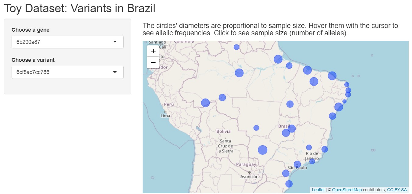
The intention of this interactive map is that the user can choose a gene and then a variant in two separate dropdown menus and check the allelic frequencies and sample sizes being automatically plotted on the map. See below a print screen of the final product:
Loading necessary packages
First, I will load some packages that will help me create a toy dataset:
library(here)
library(dplyr)
library(openxlsx)
library(ids)
library(maps)
I have talked about here and dplyr (from tidyverse) packages before. In my opinion, openxlsx is the best option to read Excel spreadsheets, since it does not require external dependencies, such as Java, to work (I had some problems with Java before trying to read large spreadsheets in R). The package ids serves to generate random or human readable and pronounceable identifiers. Lastly, the maps package will provide geographic coordinates of the Brazilian states capitals to help center the information in my interactive map.
Creating the toy dataset
Creating data points
The dataset will contain fictitious allele frequencies from samples across Brazil. Brazil is a large country that has 26 states plus a federal district, making it 27 federative units, but to simplify things, I will call it “states” hereafter. Now, let’s imagine that I would genotype two variants from three genes each in all 27 states and determined the minor allele frequency by counting how many alleles were present among the sample size of the state. Let’s assume the genes are located on autosomes (the non-sexual chromosomes). Thus, I would have 27 * 3 * 2 = 162 data points corresponding to the allele frequency for each variant in each state. To make the script customizable, I assign every number to an object:
GENES <- 3
VARIANTS <- 2
STATES <- 27
DATAPOINTS <- GENES * VARIANTS * STATES
Now I will set the random seed to make some reproducible dataset and then create two vectors with the base R sample() function. The first vector will contain 162 random numbers between 25 and 80 to represent the allele counts from the variants. The second vector will contain 27 random numbers between 100 and 500 to represent sample sizes for each state. Notice how I am multiplying by two, to ensure that sample sizes will be even numbers only, since every individual usually contributes two alleles to the sample size:
set.seed(123)
alleles_count <- sample(c(25:80), DATAPOINTS, replace = TRUE)
alleles_total <- 2 * sample(c(50:250), STATES, replace = TRUE)
Then, using the ids package I create two more vectors: one representing fictitious genes and the other, fictitious variants, respectively with the random_id() function:
genes <- random_id(GENES, 4, use_openssl = FALSE)
var_ids <- random_id(GENES * VARIANTS, 6, use_openssl = FALSE)
Notice the first argument is the number of desired random ids, so I put the constants I defined before.
Now I have two vectors that will generate the 162 data points (allelic frequencies). I will now prepare the geographic coordinates that will be needed when plotting the map.
Getting the coordinates
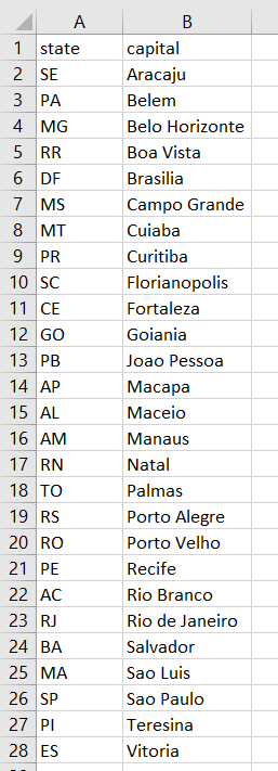
To simplify things, I listed all 27 state capitals in a spreadsheet titled states_capitals.xlsx. I then loaded it in R and associated one sample size to one state (alleles_states data frame):
br <- read.xlsx("states_capitals.xlsx")

alleles_states <- bind_cols(state = br$state, alleles_total = alleles_total)
Next, I filter a special dataset named world.cities with the name of the Brazilian state capitals using dplyr pipes. This huge dataset contains names, countries, latitude and longitude from several cities of the world and is imported by the maps package when I loaded it.
dim(world.cities)
# prints out --> [1] 43645     6
Check the dplyr pipes below:
coords <- world.cities %>% filter(country.etc == "Brazil") %>%
  filter(name %in% br$capital) %>%
  filter(lat != -26.48) %>%
  mutate(state = br$state) %>%
  select(lat, long, state)
Now let me explain. First, I obtaining only Brazilian cities by using filter(country.etc == "Brazil"). Then, I filtered the name column to get only the Brazilian state capitals by using the keyword %in% and using the capital column of the br data frame. The filter(lat != -26.48) argument is to remove a city from Paraná state that has the same name of the Tocantins state capital (Palmas). The lat means the latitude column. Next, I create a new column with mutate() to unite latitude and longitude coordinates to their respective capital. Notice that I could only do that because br$capital filter maintained the same order of the cities as it was in the input spreadsheet. Finally, I clean the data frame up by selecting only the coordinates and the state abbreviation. The result is this:
head(coords)
 lat   long state
1 -10.91 -37.07    SE
2  -1.44 -48.50    PA
3 -19.92 -43.94    MG
4   2.83 -60.66    RR
5 -15.78 -47.91    DF
6 -20.45 -54.63    MS
Joining everything
Now let’s combine three vectors: state abbreviations, genes and variants in a single data frame. First I create a small data frame combining the gene ids with the variants ids to ensure each gene has two unique variants:
gene_var_comb <- bind_cols(gene = rep(genes, each = VARIANTS), variant = var_ids)
Then I combine the state abbreviations vector with the variants vector, making the 162 data points skeleton, and with two inner joins, I can now identify each variant by its corresponding gene and each state with its corresponding sample size:
combinations <- expand.grid(state = br$state, variant = gene_var_comb$variant) %>%
  inner_join(gene_var_comb, by = "variant") %>%
  inner_join(alleles_states, by = "state")

dim(combinations)
# [1] 162   4
See that it has the correct dimensions: 162 rows (data points) and four columns (state, gene, variant and sample size). Now let’s complete the data frame by merging the alleles_count vector, joining the coordinates and calculating the minor allele frequency:
map_data <- bind_cols(combinations,
#                  alleles_count = alleles_count) %>%
  inner_join(coords, by = "state") %>%
  mutate(freq = alleles_count / alleles_total)
The result is this:
> head(map_data)
  state      variant     gene alleles_total alleles_count    lat   long       freq
1    SE 6cf8ac7cc786 6b290a87           426            55 -10.91 -37.07 0.12910798
2    PA 6cf8ac7cc786 6b290a87           264            39  -1.44 -48.50 0.14772727
3    MG 6cf8ac7cc786 6b290a87           176            75 -19.92 -43.94 0.42613636
4    RR 6cf8ac7cc786 6b290a87           206            38   2.83 -60.66 0.18446602
5    DF 6cf8ac7cc786 6b290a87           372            27 -15.78 -47.91 0.07258065
6    MS 6cf8ac7cc786 6b290a87           496            66 -20.45 -54.63 0.13306452
Now, I will save the toy dataset into a R object that will be loaded when we launch the Shiny app. I saved inside the map/data folder for reasons that will be clear in a moment.
save(map_data, file = here("map","data","map_data.RData"))
Creating named list of genes and variants
I need a named list of genes and variants to make the dropdown menus as intended. So, again I used some dplyr pipes and a lapply loop to accomplish it:
gene_list <- map_data %>% select(gene, variant) %>%
  distinct(gene, variant) %>%
  group_by(gene) %>%
  mutate(varstring = paste0(variant, collapse = ",")) %>%
  select(-variant) %>%
  distinct(gene, varstring)

genes_variants <- lapply(seq_along(gene_list$gene), function(i)

  unlist(strsplit(gene_list$varstring[i], ","))

)

names(genes_variants) <- gene_list$gene

save(genes_variants, file = here("map","data","genes_variants.RData"))
The result is a named list: each element of the list is a vector, and each of these vectors are named after a gene. Each vector, in turn, contains the corresponding variants:
head(genes_variants)
$`6b290a87`
[1] "6cf8ac7cc786" "c1c7fc20d1b9"

$`153a782d`
[1] "6aab8d277c3c" "4c9ff4a7f4fb"

$b053b654
[1] "adf90f0908c9" "c523d6d80697"
Notice that I also saved it into the map/data folder.
.
├── map
│   └── data
│       ├── genes_variants.RData
│       └── map_data.RData
├── map_data.R # contains the code demonstrated here
└── state_capitals.xlsx
Creating Shiny ui.R file
We can divide the Shiny app internals in two main functions: ui and server. The former will manage the user interface of the app (the front-end) and the latter will manipulate the data for interactive visualization (the back-end). I will save each function into two separate files, server.R and ui.R. Let’s examine the ui.R file:
ui <- fluidPage(
  titlePanel("Toy Dataset: Variants in Brazil"),

  sidebarLayout(
    sidebarPanel(
      selectInput("gene", label = "Choose a gene", names(genes_variants)),
      selectInput("variant", label = "Choose a variant", genes_variants[[1]]),
    ),


    mainPanel(
      h4("The circles' diameters are proportional to sample size. Hover them with the cursor to see allelic frequencies. Click to see sample size (number of alleles)."),

      leafletOutput(outputId = "map")
    )
  )
)
The fluidPage() Shiny function creates an webpage that fits browser dimensions and generate the overall layout of the app. This function receives other functions as arguments. Each function will take care of one aspect of the layout. The first function, titlePanel() generates the main title of the app, the second, sidebarLayout() instructs Shiny to create an app with a sidebar and a main panel. The arguments of this function will control the elements inside each area.
The sidebarPanel() function builds the sidebar. Since I wanted the dropdown menus to be placed in the sidebar, I enclose two selectInput() functions, one for the genes and one for the variants. Notice that it requires three arguments: an internal name (“genes” or “variant”) so the server function can access the inputs, a human-readable label (“Choose a gene”, “Choose a variant”) and the input options. Notice that I am referring to the genes_variants named list I created in the previous step.
The mainPanel() function builds the main panel. The map will be placed there. The hx() function creates a header, where x is an integer between 1 and 6. The lower the number, the higher is the level of the header. Thus, h1() generates big headers, h2() generates a smaller header and so on. I chose h4() to enclose a brief description of how to interact with the map. The leafletOutput() function will build the map. It is a function from the leaflet package. The argument outputId creates the internal name of the output to be accessed by the server function.
Creating Shiny server.R file
It contains the server function that receive three arguments: input, output and session. Notice that we must wrote the server function, whereas the ui function is mostly controlled by the Shiny package itself. See below:
server <- function(input, output, session) {

  observe({
    updateSelectInput(session, "variant", choices = genes_variants[[input$gene]])
  })

  data_subset <- reactive({
    df <- map_data %>% filter(gene == input$gene & variant == input$variant)

    return(df)
  })

  output$map <- renderLeaflet({
    leaflet(data_subset()) %>%
      setView(lat = -14.235004, lng = -51.92528, zoom = 4) %>%
      addTiles() %>%
      addCircles(
        lat = ~lat,
        lng = ~long,
        weight = 1,
        radius = ~ sqrt(alleles_total) * 5000,
        popup = ~ as.character(paste0("Alleles: ", alleles_total)),
        label = ~ as.character(paste0(input$variant, " Allele frequency: ", round(freq, digits = 2))),
        fillOpacity = 0.5
      )
  })
}
The user options during the interaction with the app will be stored into the input object. The output will access the output id defined in the ui.R file (“map”). The session object will keep track of the different options of the user. For example, the user must choose a gene. Then, the variant dropdown menu must change accordingly to display the variants of said gene. This is why I included the observe() function. Anytime the user chooses a different gene, the updateSelectInput() will change the “variant” selectInput().
Each user selection will display different data on the map. Therefore, the data_subset(reactive()) nested functions will take the user input and filter the desired data stored in the map_data object I created earlier. Notice that input$gene and input$variant are referring to the selectInput() defined in the ui.R file. They get the user option and populate the filters.
Lastly, the renderLeaflet() function output (controlled by the definitions enclosed in the leaflet() function) will be assigned to the output$map object. “map” is referring to the outputId defined in the ui.R file, therefore making the map appear on the main panel.
Let’s talk more about the leaflet() function arguments. First, it receives as input the data_subset() output, which is the filtered data based on the user input. Using dplyr‘s pipes, I pass other options to the function. The setView() function serves to center the map on the specified latitude and longitude, as well as the zoom level. The addCircles() will plot circles based on the geographic coordinates stored in the filtered map_data object. To make circle size appear proportional as the sample size, I multiply the square root of the sample size by a constant. Next, I created two labels: one that appears on clicking and the other appears on hovering the circle so the user can see sample size and allele frequency, respectively.
Creating global.R file
The optional global.R file contents are read during the Shiny app initialization and are placed in global scope during the app execution session. Therefore, it is useful when there is the need to load data and packages necessary for the app buildup, which is exactly my case: I need to load the map data, the gene lists, and the leaflet and dplyr packages. Provided that the ui and server functions are saved in two different files (ui.R and server.R), the global.R is automatically loaded during app initialization.
Check the global.R file contents:
load("data/map_data.RData")

load("data/genes_variants.RData")

if(!require(leaflet)){
  install.packages(c("leaflet", "leaflet.extras"))
  library(leaflet)
}

if(!require(dplyr)){
  install.packages("dplyr")
  library(dplyr)
}
First, I load the data stored into the map/data folder. Next, the if(!require()){} constructs will check if the packages exist and load them or install and then load them otherwise.
Executing the Shiny app
It is very simple to execute a Shiny app locally. Simply place the ui.R, server.R and global.R (if it exists) inside a folder. I placed everything into the map folder:
.
├── map
│   ├── global.R
│   ├── server.R
│   ├── ui.R
│   └── data
│       ├── genes_variants.RData
│       └── map_data.RData
├── map_data.R
└── state_capitals.xlsx
Then, simply run the runApp() Shiny function with the name of the folder (install Shiny if you have not yet):
if(!require(shiny)){
  install.packages("shiny")
  library(shiny)
}

runApp("map")
# or
# shiny::runApp("map")
Just make sure the R session current working directory is the parent of the Shiny app folder, otherwise it will not work. Since I am running RStudio, a window containing the interactive map opens up and I can interact with the map. Otherwise you would have to open a browser window and go to the address displayed on the R console, something like http://127.0.0.1:<some_port>.
The interactive map is rather barebones, but it works. Try to replicate and improve it if you wish!
Hosting Shiny apps on the web
This demo showed how to locally execute a Shiny app. There are some options if you wish to host your app on the web to everyone use, both free and paid. For example, RStudio shinyapps.io offers free limited hosting of up to three apps. DigitalOcean offer small-scale paid services that can host Shiny apps (check a great tutorial by Dean Attali).
Conclusion
In conclusion, I:
- Created toy data simulating allele counts across several regions of Brazil;
- Showed how to obtain geographic coordinates;
- Demonstrated how to create an interactive map with Shiny to visualize sample sizes and allelic frequencies displayed on a Brazilian map.
Subscribe to my RSS feed, Atom feed or Telegram channel to keep you updated whenever I post new content.
References
RStudio | Open source & professional software for data science teams
Droplets - Scalable Virtual Machines | DigitalOcean
How to get your very own RStudio Server and Shiny Server with DigitalOcean